Forget the tired intro lines about today’s fast-paced world. Let’s be real, the freight industry has always been about speed, efficiency, and getting the job done. But in a market where everyone’s promising the same thing, how do you make your freight company stand out? It’s not just about the horsepower under the hood anymore; it’s about the horsepower of your brand.
That’s where a killer logo comes in. It’s the first handshake with a potential client, the visual shortcut to everything your company represents. A strong logo builds trust, screams professionalism, and makes you unforgettable in a crowded marketplace. Think of it as your company’s signature – bold, distinct, and leaving a lasting impression.
This isn’t just about slapping a truck on a business card and calling it a day. This is about strategic freight branding, crafting a visual identity in logistics that captures attention and drives business. We’ll break down the essential logo design tips and branding strategies for logistics that separate the leaders from the laggards.
Ready to transform your brand and haul in more clients?
Let’s dive in.
The Importance of Logo Design in the Freight Industry
Forget the fancy trucks and the cutting-edge logistics software for a minute. Before a potential client even gets a glimpse of your operational prowess, they see your logo. In the freight industry, where first impressions are often formed online or on the side of a trailer speeding down the highway, your logo is your initial handshake, your silent salesperson. It’s the cornerstone of your freight branding and the visual representation of your company’s values.
Think of iconic brands like FedEx or UPS. Their logos are instantly recognizable symbols of speed, reliability, and professionalism. That’s the power of effective logo design for freight companies. It’s not just about aesthetics; it’s about strategically crafting a visual identity in logistics that resonates with your target audience and drives business growth.
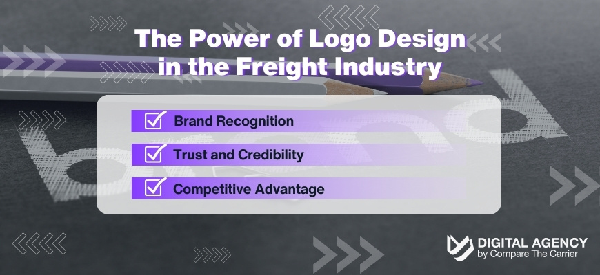
Here’s a breakdown of why logo design is crucial for freight companies:
Investing in professional logo design is an investment in your company’s future. Professional design, particularly a tailored logistics branding design, not only boosts recognition but solidifies trust across all client interactions.
Key Elements of Effective Logo Design
Crafting a logo that truly resonates with your target audience and elevates your freight branding requires careful consideration of several key elements. It’s about striking the right balance between aesthetics and strategic communication. Here’s what makes a logo design truly impactful for freight companies:
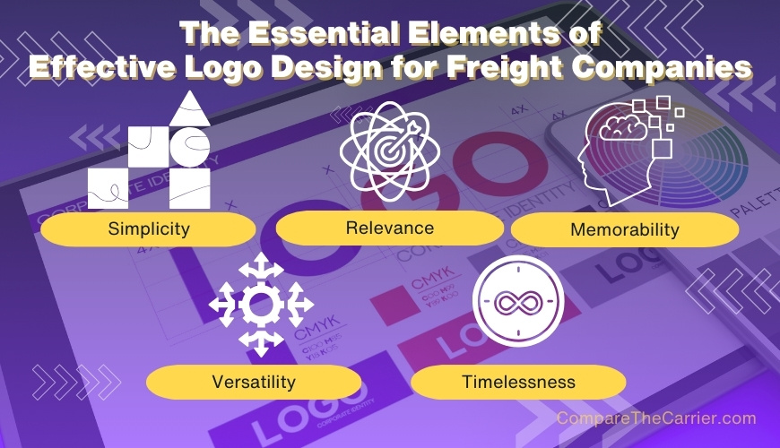
By incorporating these key elements into your logo design, you can create a powerful visual identity that strengthens your freight branding, builds trust with clients, and sets you apart in the competitive logistics landscape.
Achieving the perfect balance of simplicity and memorability in logo design requires professional insight. Discover how our branding experts can help craft a logo that stands the test of time and adapts beautifully across all media.
Common Pitfalls in Freight Logo Design and How to Avoid Them
Even with the best intentions, it’s easy to fall into common traps when designing a logo for your freight company. Being aware of these pitfalls can help you steer clear and ensure your logo effectively represents your brand and resonates with your target audience.
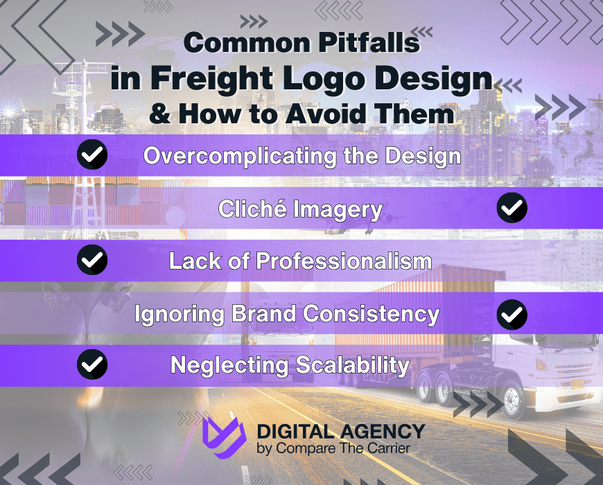
By avoiding these common pitfalls and adhering to logo design best practices, you can create a visual identity that strengthens your freight branding, builds trust with clients, and sets you apart in the competitive logistics industry.
Avoid common logo design pitfalls by consulting with our experienced designers. Explore our branding services that ensure your logo is both professional and perfectly aligned with your brand identity.
Strategic Logo Design Tips for the Logistics Sector
Creating a logo that truly captures the essence of your freight company and resonates with your target audience requires a strategic approach.
Here are some essential logo design tips to keep in mind:
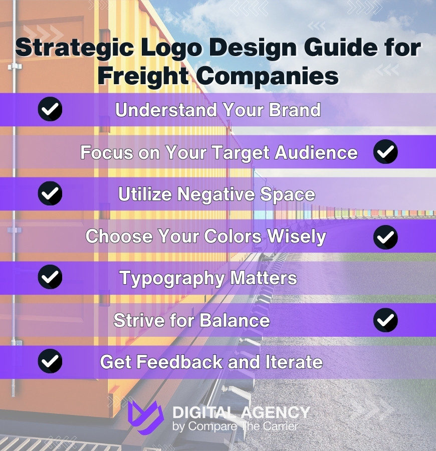
By following these strategic logo design tips, you can create a visual identity that strengthens your freight branding, enhances your credibility, and helps you stand out in the competitive logistics market. And as you embrace these strategic logo design tips, consider integrating online marketing strategies that are forecasted to dominate the logistics sector in 2026.
For strategic guidance and expert design services that reflect the essence of your freight company, partner with us. Check out our comprehensive logo design solutions.
Case Studies: Success Stories of Freight Branding
Let’s take a look at some real-world examples of how effective logo design and branding strategies have helped freight companies achieve success in the logistics sector:

The FedEx logo is a classic example of impactful design. Its simple, bold typography and iconic purple and orange color scheme are instantly recognizable worldwide. The color combination was no accident; purple conveys a sense of luxury and reliability, while orange adds energy and enthusiasm. But the true brilliance lies in the hidden arrow formed by the negative space between the “E” and “x.” This subtle design element cleverly communicates the company’s core values of speed and precision.
Just as FedEx’s logo embodies speed and precision, the company’s adoption of AI technologies propels it to new heights of operational efficiency.
FedEx’s consistent branding across all touchpoints, from their trucks and planes to their packaging and website, has solidified their position as a global leader in logistics.

DHL’s logo is another example of effective freight branding. The bold, dynamic typeface and vibrant red and yellow color scheme convey a sense of energy, urgency, and global reach. DHL aims to be “the logistics company for the world,” and their logo reflects this ambition. The slanted lines in the logo create a sense of movement and forward momentum, reflecting the company’s commitment to fast and efficient delivery. DHL’s consistent use of its logo and brand colors across its vast network of vehicles, packaging, and marketing materials has helped establish a strong and unified brand presence in the logistics industry.

X PO Logistics provides a compelling case study in the importance of adapting your brand to reflect your company’s evolution. Initially, their logo was a simple wordmark, but as they expanded their services and technology, they recognized the need for a more dynamic visual identity. In 2011, they unveiled a new logo featuring a stylized “X” that symbolizes their interconnected network and ability to connect businesses to a world of possibilities. This “X” also represents their commitment to innovation, exemplified by their use of cutting-edge technology like machine learning to optimize freight transport. The vibrant green color in the logo further emphasizes this forward-thinking approach and commitment to growth. This rebranding, coupled with a commitment to brand consistency across their extensive North American LTL fleet (as detailed in their 2019 Brand Book), has undoubtedly played a role in their success.
Inspired by these success stories? Begin your journey towards a standout brand with our professional design services, tailored to your unique needs in the logistics industry.
These case studies demonstrate the power of strategic logo design and branding in the freight industry. By investing in a strong visual identity, freight companies can enhance their brand recognition, build trust with clients, and differentiate themselves from the competition.
Conclusion
Effective logo design and strategic branding are more than just surface aesthetics for freight companies—they are essential tools that drive recognition, build trust, and differentiate businesses in a competitive logistics landscape. As we’ve explored through various case studies, companies like FedEx, DHL, and XPO Logistics have mastered the art of using their logos not only as a mark of identity but as a powerful component of their overall business strategy.
Investing in a thoughtful visual identity enables companies to communicate their values clearly and effectively. This is not merely about creating a visually pleasing image, but about crafting an identity that resonates deeply with the target audience, enhancing both market presence and customer loyalty, which is vital for any successful inbound marketing effort.
For freight companies aiming to elevate their brand or carve out a new space in the market, the journey begins with recognizing the power of branding. Partnering with professionals like Compare The Carrier Digital Agency can transform a logo from a basic necessity into a fundamental asset that propels business growth and solidifies your place in the global logistics network. Engage with us today to harness the full potential of your brand and make your mark in the bustling world of freight and logistics.
FAQ
What is the typical budget for professional logo design for a freight company?
A professional freight company logo typically costs between $500 and $2,500. Independent freelance designers generally charge $300 to $800, while specialized B2B branding agencies charge $1,500 to $5,000+ for comprehensive brand identity packages. Costs depend heavily on the inclusion of vector files, brand guidelines, and commercial usage rights.
Do I need a logo if I am just starting my freight brokerage?
Yes, a professional logo is critical for new freight brokerages to establish immediate trust with shippers and carriers. It visually separates a legitimate startup from fly-by-night operations. A strong visual identity directly increases the acceptance rate of initial cold outreach emails and improves conversion rates on company websites.
How often should a logistics or freight company update its logo?
Freight companies typically refresh their logos every 7 to 10 years. A redesign becomes necessary when expanding services (e.g., adding air freight to a trucking business), undergoing a corporate merger, or when the current design looks pixelated on digital platforms. Minor geometric refinements often perform better than complete overhauls.
How important is it to trademark a freight company logo?
Trademarking your logo with the USPTO is essential for interstate freight operators. It legally prevents competitors from using confusingly similar branding to steal clients or damage your reputation. Without federal trademark protection, you risk facing expensive rebranding if another regional logistics company registers a similar design first.
Should a logistics logo include the company name or just a symbol?
New freight companies should use a combination mark containing both a visual symbol and the full company name. Standalone symbols only work for globally recognized brands. A combination mark builds name recognition while providing an adaptable icon that can be used independently for social media avatars and mobile apps.
How do I ensure my logo looks sharp on 53-foot trailers and uniforms?
Always demand your final logo files in scalable vector formats like .EPS, .SVG, or .AI. Vector graphics use mathematical equations rather than fixed pixels, allowing the design to scale from a small embroidered uniform patch to a massive trailer wrap without losing clarity. Never use .JPG files for printing.
